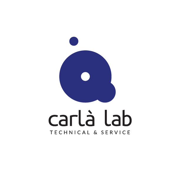
The project was born with the objective of creating an essential visual mark, rooted in a rigorous study of geometric proportions, rhythm, and the balance between positive and negative space. The identity strips away any redundant decorative elements, focusing instead on the archetypal strength of circular forms and typographic clarity.